if we wish make a chart in google docsIt’s too easy to achieve. We do not need to use another application to do it. We will simply insert the chart and add the relevant data.
When we create a chart in Docs, it takes us to Google Sheets so we can replace all that default data with what we want. Afterwards, we can proceed to customize the graphic to achieve a look that suits our needs, all without the need to use another application.
Table of Contents
Insert a chart in Google Docs
We will have to enter the official website of Google Docs, if we have not logged in we will proceed to start it with our credentials.
Now we are going to go to the Insert tab and go to Chart. Here we can choose whether to add a bar chart, a column chart, a line chart, or a pie chart. In case we had created a graph in Google spreadsheets (Google Sheets) we can also add it from this section.
The chart we select will automatically appear in our document with the specified data. We will be able to see a small message in the lower left part where it provides us with a link to be able to edit it from Google Sheets. So we will proceed to click on Edit in Sheets to do it.
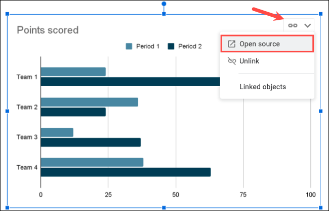
In case this message disappears before we can click, there is no need to worry. We will have to click on the graphic and then on the arrow in the upper right corner, we will choose Open Source and that’s it.
Edit and add chart data from Google Sheets
Once the linked spreadsheet is in Google Sheets, let’s look at the data and the graph. We can replace this data with whatever we want. The graph will update itself without us having to do much more.
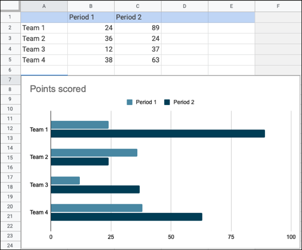
From this section, we can work with the data and the graph in Google Sheets as if we had created it here. We can add another series to a bar chart or more pieces to a pie chart, for example.
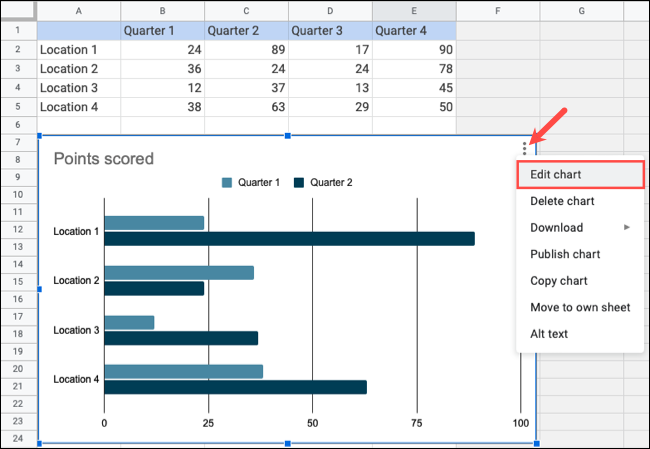
So, we’ll use the area in the spreadsheet to be able to edit and add data. We can include more columns or rows, we will double click on the graph and we will click on the three dots icon that is in the upper right part and we choose “Edit graph”.
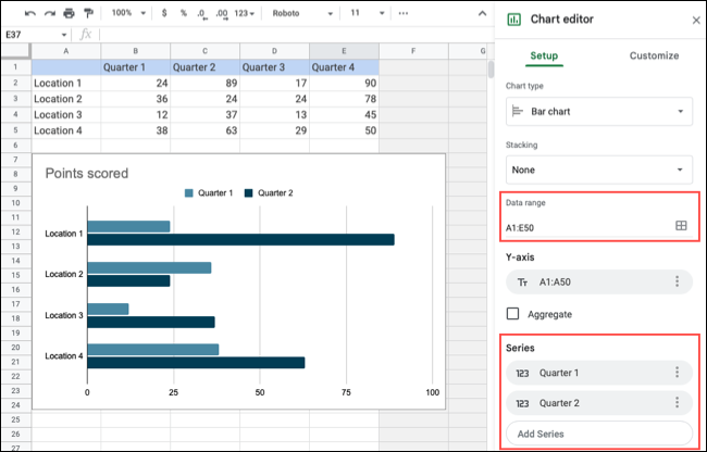
Once the Chart Editor sidebar opens, we’ll need to head over to Settings. Here we can adjust the cells in the Data Range field depending on our needs. Then, we go to the Series section to be able to include the additional series in our chart.
Customize chart elements and appearance
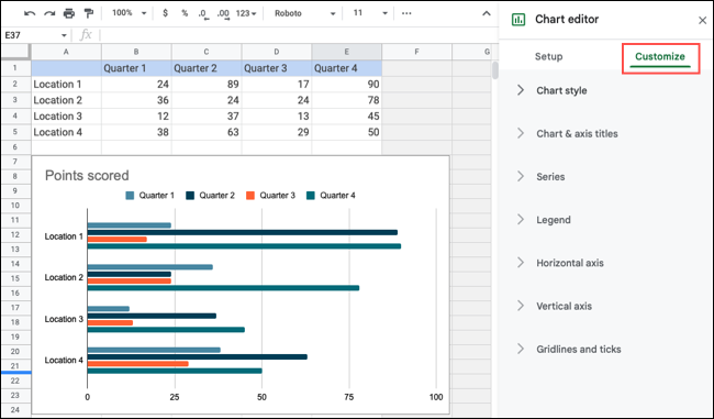
In case we want to change the colors of the chart, add a title or display grid lines. We can achieve this from the sidebar of the Chart Editor and selecting the Customize tab.
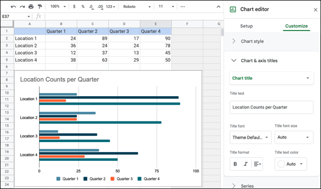
After this, we can expand each of these sections to customize the chart. We will use the area, Chart style to be able to modify the colors, Chart title and axes to change the title and font of the letter, Grid lines and marks to modify these elements.
Changes are automatically saved when we make them, so you don’t need to do anything else.
Update the Google Docs chart
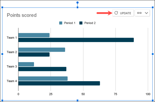
Once we’re done making all the changes to the Sheets chart, we’ll need to go back to our document in Docs. We will be able to see a button that says Update in the upper right part of the graph.
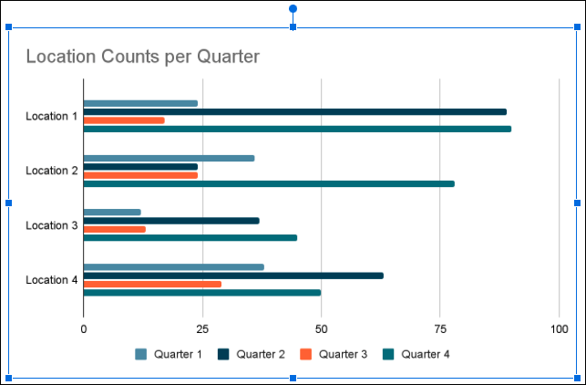
By clicking on Refresh, we will be able to see all the changes that we have previously made to the graph from Google Sheets.
Obviously, we can modify our graph as many times as we want in the same way that we discuss it in this guide.